Research, Design, & Branding
Delivering an End-to-End High-Fidelity Real Estate MVP

intro
Client
Dubai State (Real Estate Agency)
Develop a responsive website to enhance brand trust and provide a user-friendly property listing experience for their audience.
Role/Responsibilities
Solo UX Designer responsible for end-to-end process including:
- Competitive Analysis
- Information Architecture
- Wireframing
- UI Design
Tools
"Inked Colibri" : Custom Figma Plugin developed by me, featuring:
- Advanced Color Management & Swatch Generation
- APCA-Compliant Contrast Analysis
- JSON-driven Design Token Management
- Structured CSS Token Export for development
UX Design Strategy
Our aim is a clean, user-friendly website structure. To ensure an easy launch, we will focus on an MVP (Minimum Viable Product) for real estate, confirming the client can provide listings while publishing properties.
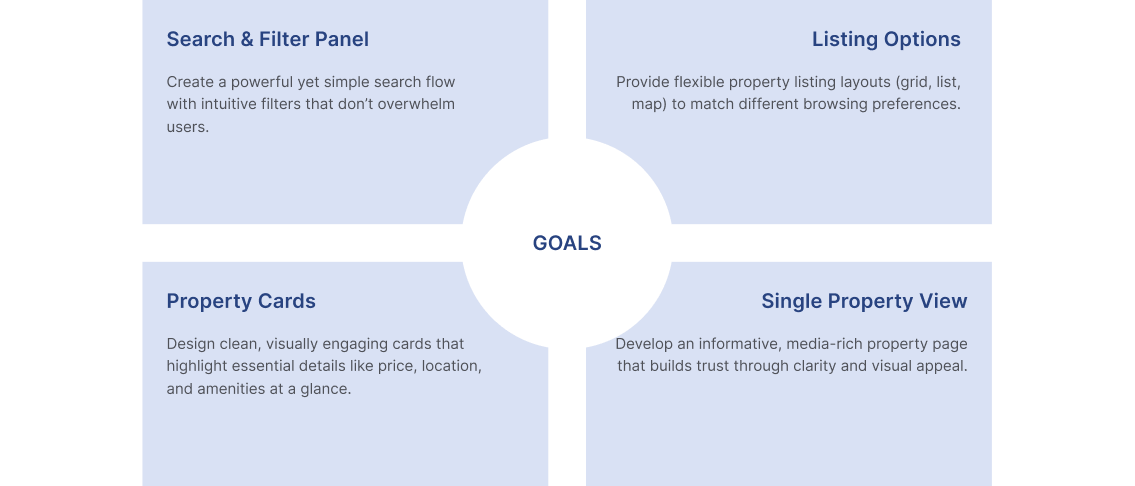
Competitive Research Goals (MVP)
- Search & Filter Panel
- Listing Options
- Card Component
- Property View
Sitemap / Information Arch
Our research provided deep insights into competitors and similar websites. After comparing the results and incorporating client information, we were ready to create the MVP sitemap and information architecture.
Low Wireframe
- Header with integrated Search Panel
- Listing View (Grid and Map)
- Property View (including Realtor cards and Amenities)
COMPETITIVE INSIGHTS
| Competitor | Search & Filter Panel | Listing Options | Property Card | Single Property View |
|---|---|---|---|---|
| emirates.estate | Basic filters, not very detailed Pending | Simple listing grid Pending | Standard card with limited visuals Pending | Minimal Property detail view Pending |
| green-acres.ae | Very limited filters Pending | Only buy listings Pending | Plain cards, text-heavy Pending | Simple property view Pending |
| bayut.com | Advanced, detailed filtering Accepted | Multiple view options, responsive layout Accepted | Rich visuals, strong branding Accepted | Engaging detail view with interactive media Accepted |
| monserrateinmobiliaria.com | Clunky filters, not intuitive Rejected | Covers buy, rent, vacation Pending | Inconsistent card designs Rejected | Outdated property view Rejected |
Key Takeaways
- Search & Filter: Must balance detail with clarity to avoid overwhelming users.
- Listing Options: Multiple display modes (grid, list, map) improve usability and cater to different user preferences.
- Property Cards: Clear visuals and structured information increase scannability.
- Property View: Detailed, media-rich pages engage users and build trust.
- Consistency & Speed: Strong design systems and optimized performance are essential for credibility.
UX DESIGN STRATEGY
The strategy centered on creating a clean, user-friendly website structure that simplifies property discovery and builds trust with users. Instead of overloading the platform with features, we focused on designing a Minimum Viable Product (MVP). This allowed for a faster launch while ensuring the essential features—like property listings, search, and filtering—were in place from the start.
By prioritizing an MVP approach, we could:
- Validate that the client could consistently provide and manage property listings.
- Launch quickly without sacrificing usability.
- Collect early user feedback to guide iterative improvements.
The strategy also emphasized:
- Clarity over clutter: Straightforward navigation and intuitive filters reduce user effort.
- Scalability: The design system supports future growth, such as adding vacation rentals, agent dashboards, or advanced search features.
- Consistency: Establishing a strong visual and interaction language prevents the inconsistencies found in competitors’ platforms.
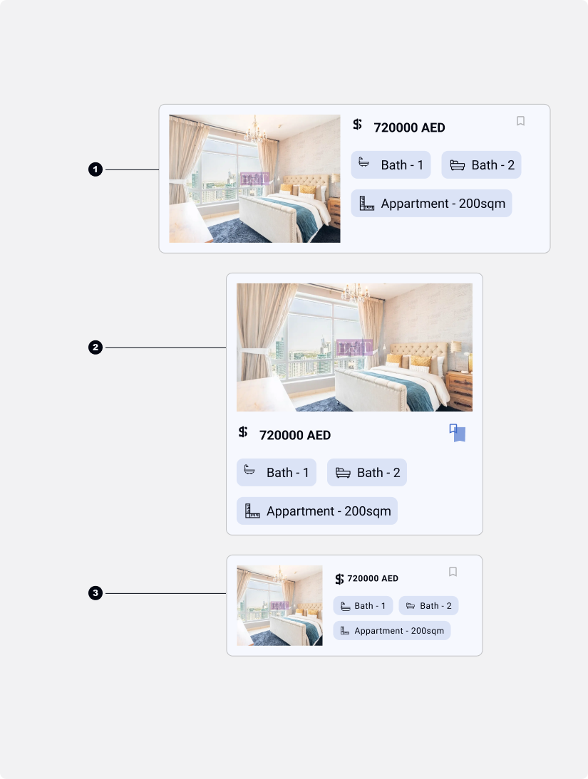
Research Insight: Property Cards
Our research revealed significant variation in property card designs. Different real estate platforms display different information fields based on their specific focus and property types.
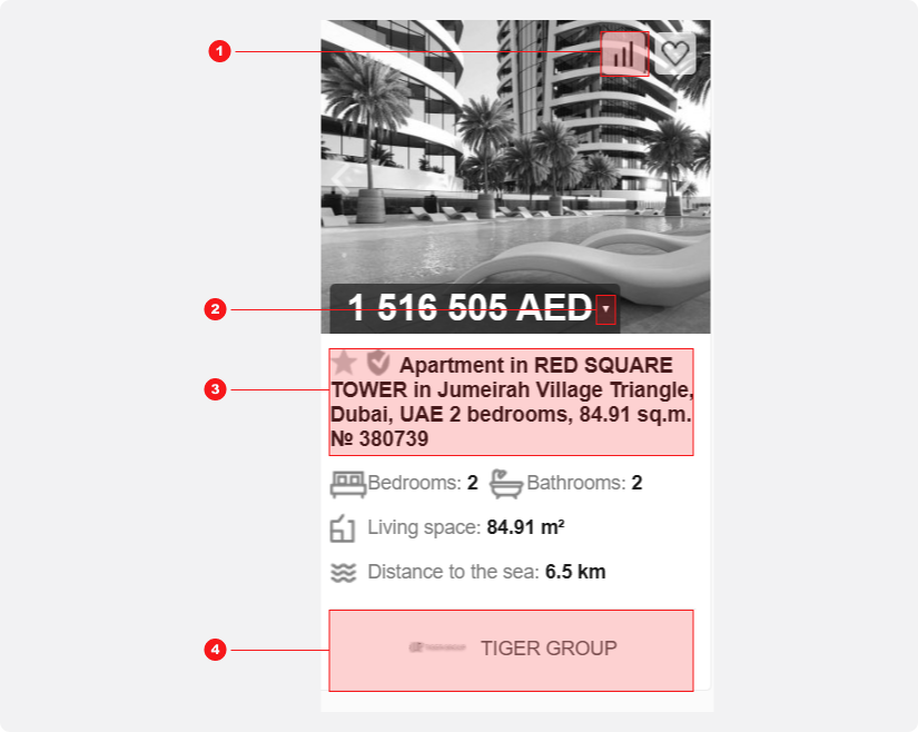
Competitor Card Example
This card suffers from visual inconsistency and poor use of space. More critically, it presents an information overload, displaying data irrelevant to someone searching for an apartment.
- A "Statistics" button with no clear user value.
- A dropdown for currency conversion, adding complexity for local seekers
- Redundant icons and text that repeat key details (beds, baths, area).
- Company logo distracting from the property information.
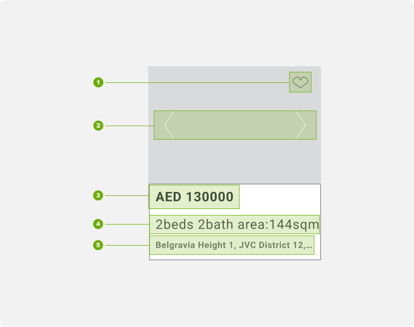
Card Wireframe Snapshot
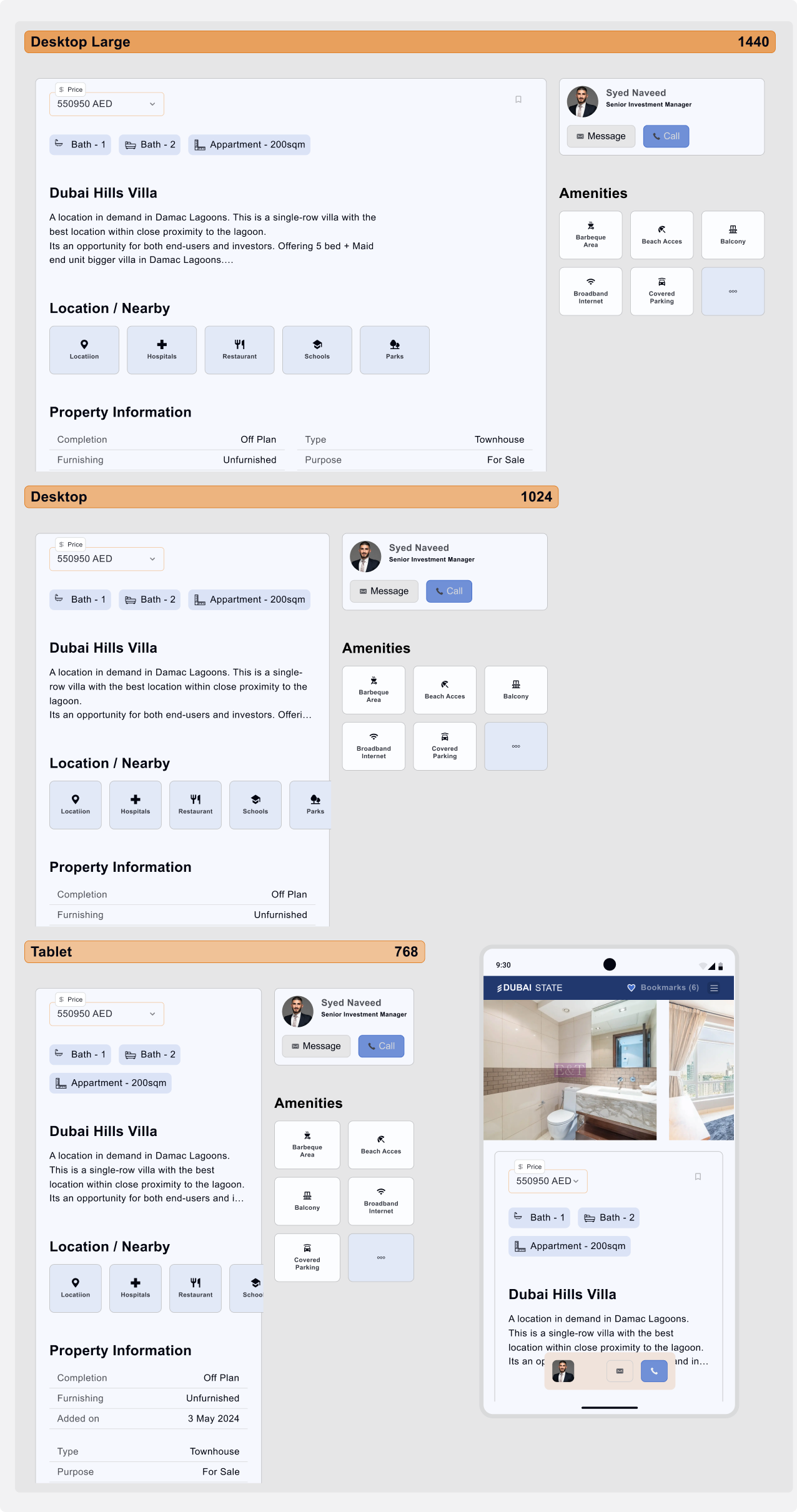
We minimized the information to only essential fields and actions for property exploration:
- Bookmark: An icon in the top-right shows bookmark status. The entire corner is a tappable area, allowing users to bookmark without entering the property view.
- Thumbnail Slider: Enables users to browse all property images directly from the card.
- Price and Currency info
- Beds Baths and Area Information
- Interactive Location: The location text is clickable. Tapping the bottom card area opens a map modal showing the property's location.
Card Component: High-Fidelity
We developed a final card design that is both minimalist and informative, with specific layouts for different contexts:
- List View: Uses a horizontal, filled card layout.
- Grid View: Uses a vertical card layout.
- Mobile List View: Also uses a horizontal, filled card layout for consistency.
Competitor Card Example
We removed the dedicated location field to streamline the card's interaction model. This decision was made for two key reasons:
Reduced Complexity: The card already had multiple clickable areas (bookmark, thumbnail slider). Removing the location link simplified the interface and prevented potential user errors.
Alternative Access: In the list view, users can select a card using the provided arrow, which highlights the property and provides full details, including its location, in a dedicated panel or modal.
Future Validation via A/B Testing
This design decision will be validated through post-launch testing:
Method: A/B test on mobile (with/without the location link).
Measurement: Use session replay tools (e.g., Hotjar) to analyze map modal engagement.
Goal: Filter accidental clicks to determine if the feature is necessary.
Header Responsiveness: A Mobile View Challenge
The generic approach to header responsiveness involves hiding primary filter fields in a modal on smaller screens. While this works for tablet sizes (768px), it becomes problematic on mobile:
- Mobile (480px): Limited space forces us to show only "The Deal" type and a Search button.
- Small Mobile: Only a single Search field is available.
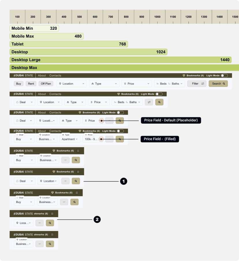
Header Responsiveness: A Mobile View Solution
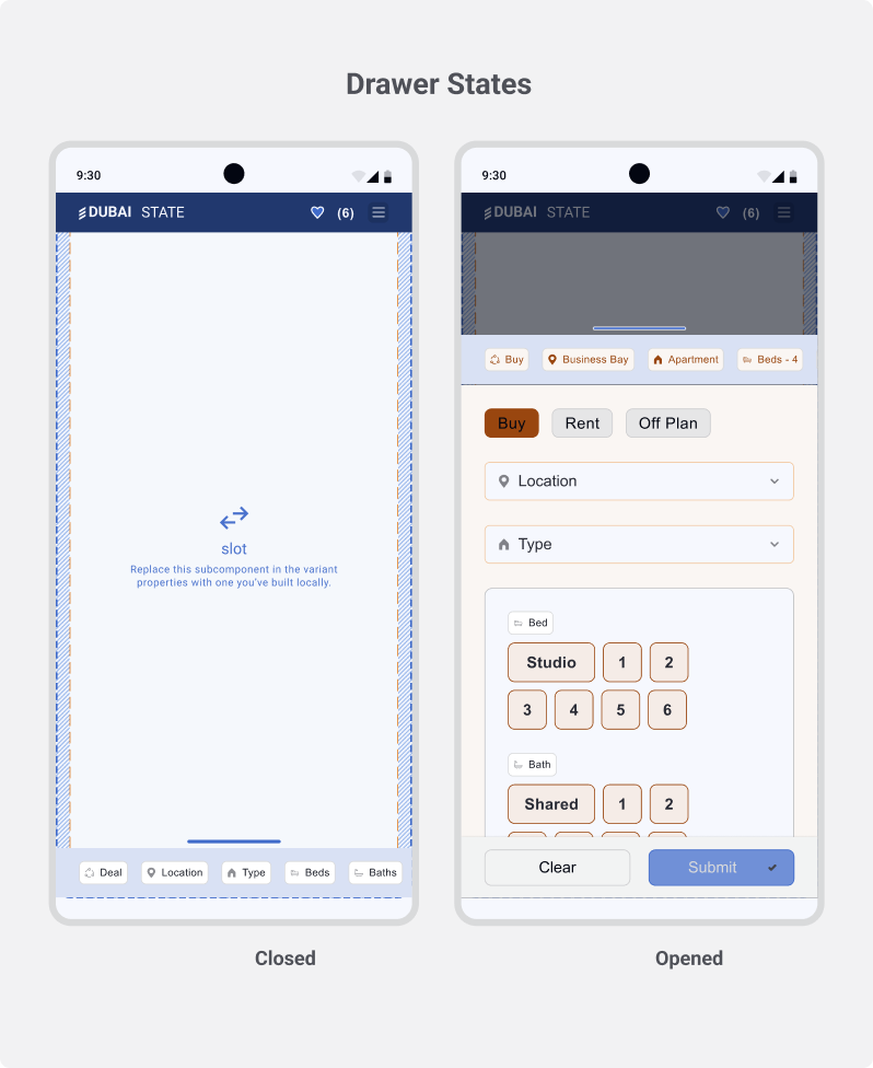
Proposed Mobile Solution: Filter Drawer with Tags
To address mobile limitations, we will implement a dedicated design pattern: a Filter Drawer.
- Accessibility: A single button triggers a full-screen drawer, housing all filter fields.
- Clarity & Context: Selected filters are displayed as tags at the top, providing clear feedback and allowing users to remove them easily.
- Usability: This pattern maximizes the use of the vertical screen space, creating a focused and manageable filtering experience on mobile.
This approach ensures all functionality remains accessible without compromising the mobile interface's simplicity.

Bottom Oriented Drawer
A thumb-friendly drawer that slides up from the bottom, displaying all filter fields in an accessible location.
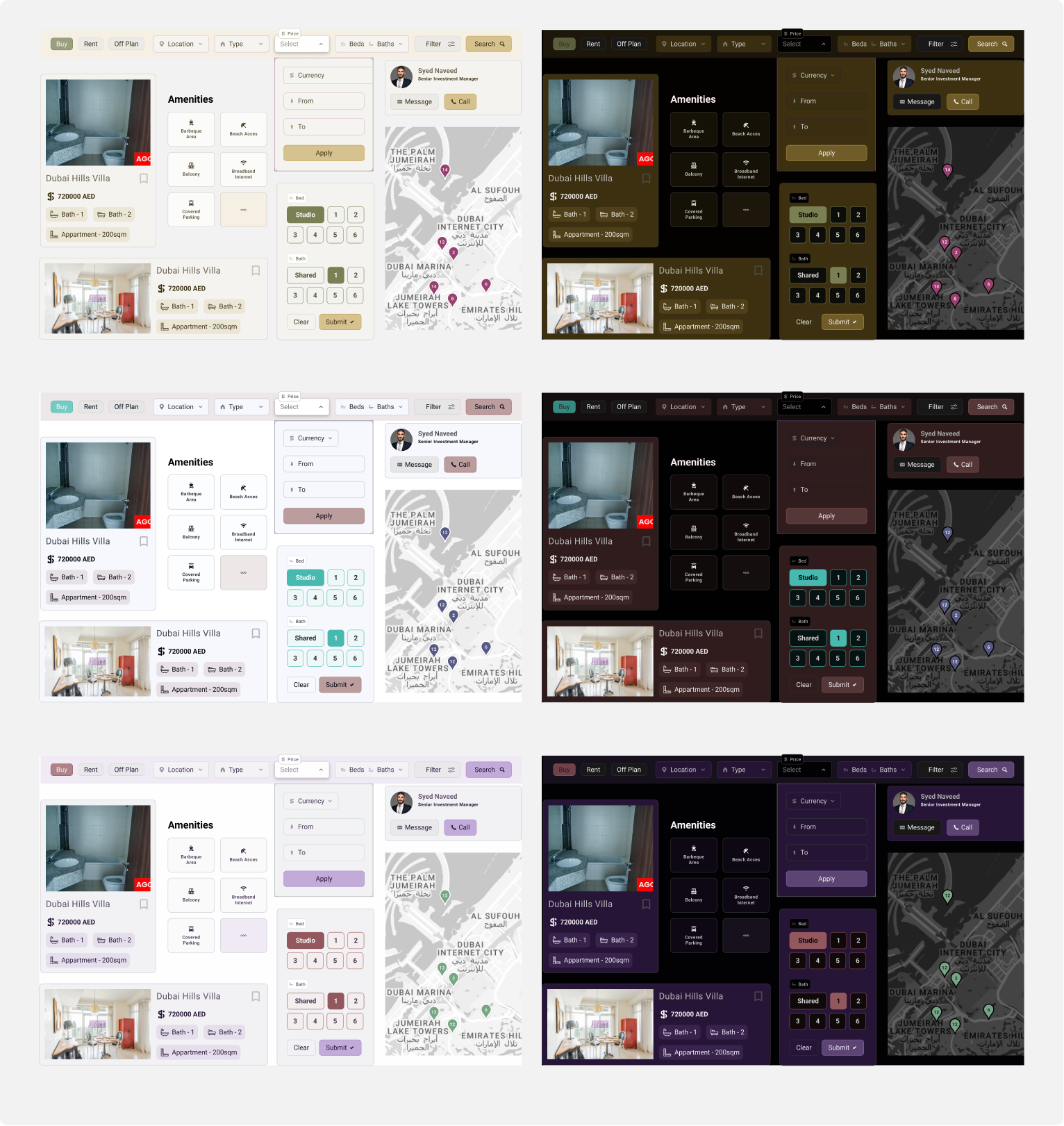
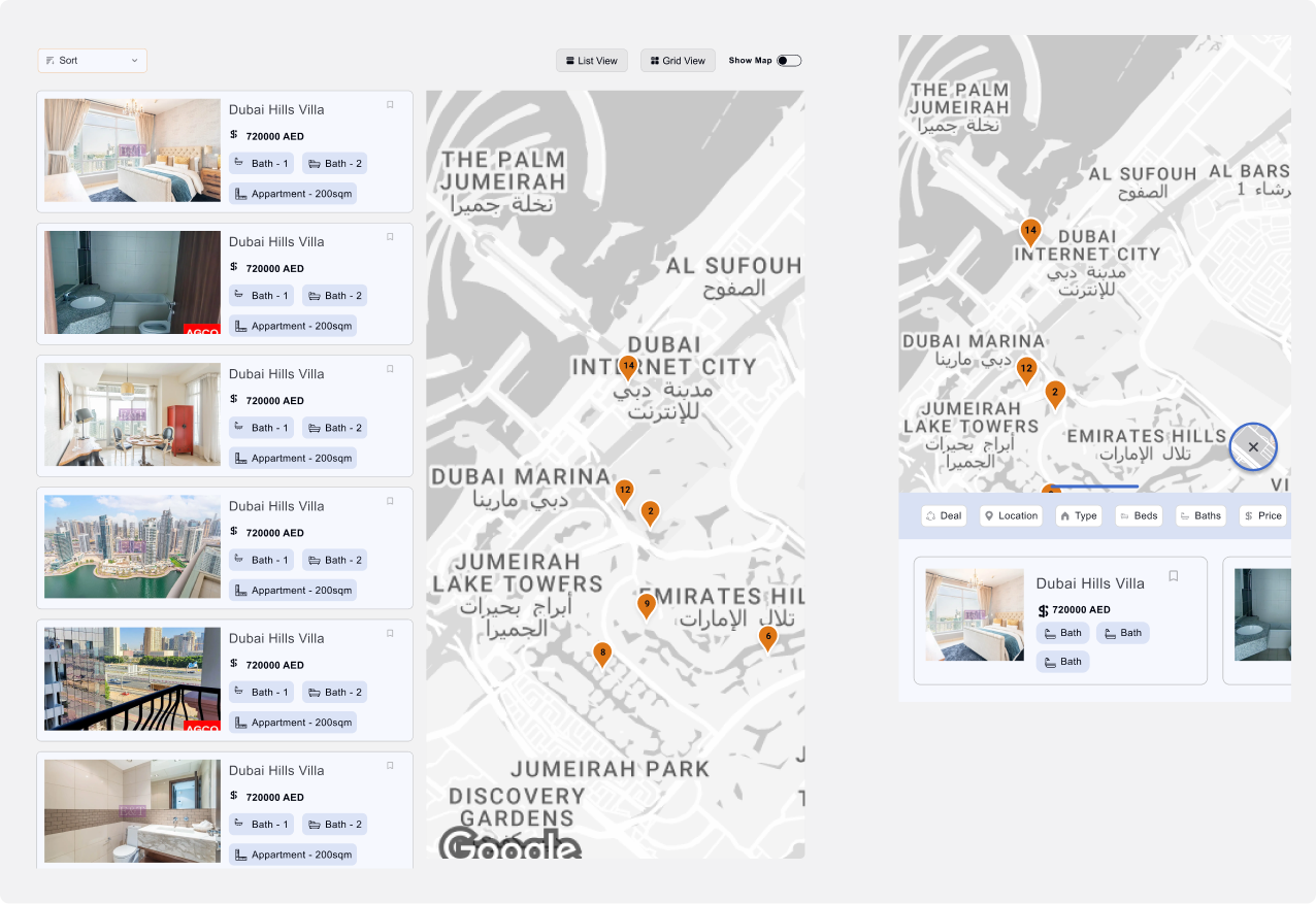
List/Map View Desktop vs Mobile
Property View
Components Showcase Light vs Dark
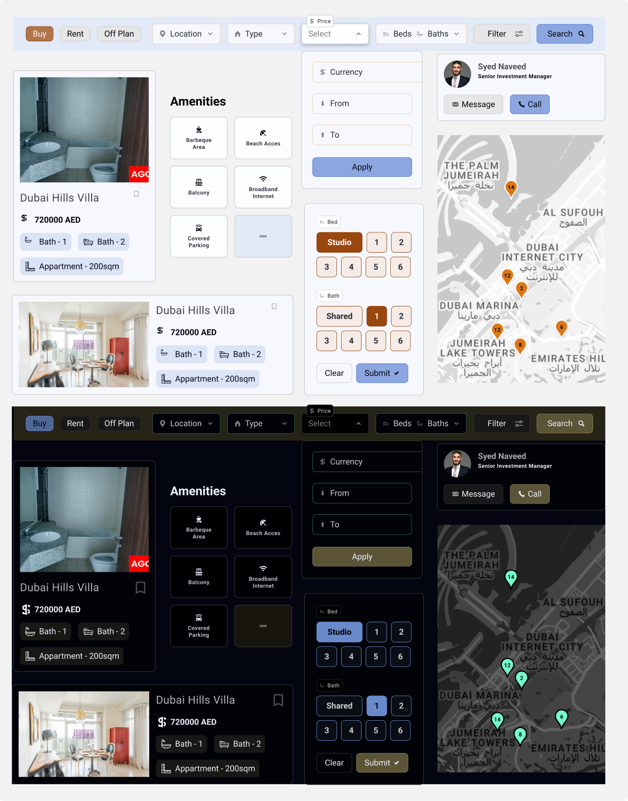
The Advantage of Using Inked Colibri Color Variables
This system allows for rapid color scheme experimentation. It streamlines collaboration with clients on branding and simplifies handoff to development, as exporting updated CSS tokens automatically applies the new color scheme.